TypeBrand + Print
RoleIdentity, illustration, print system
Year2024
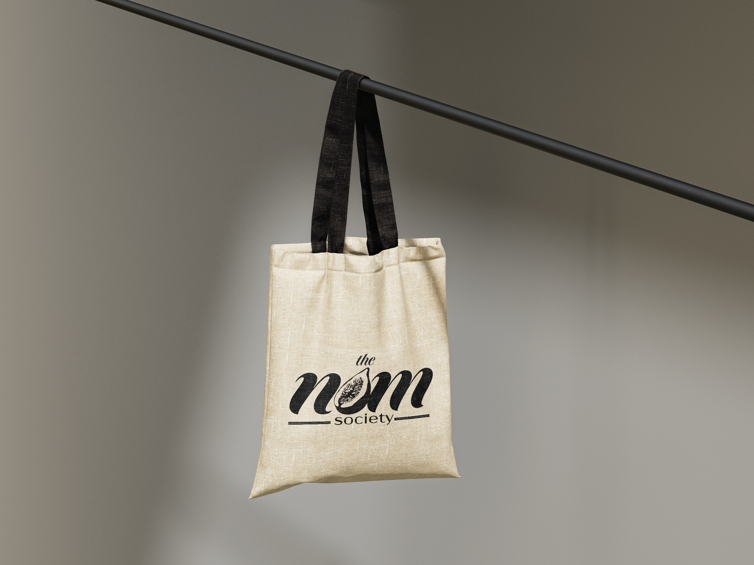
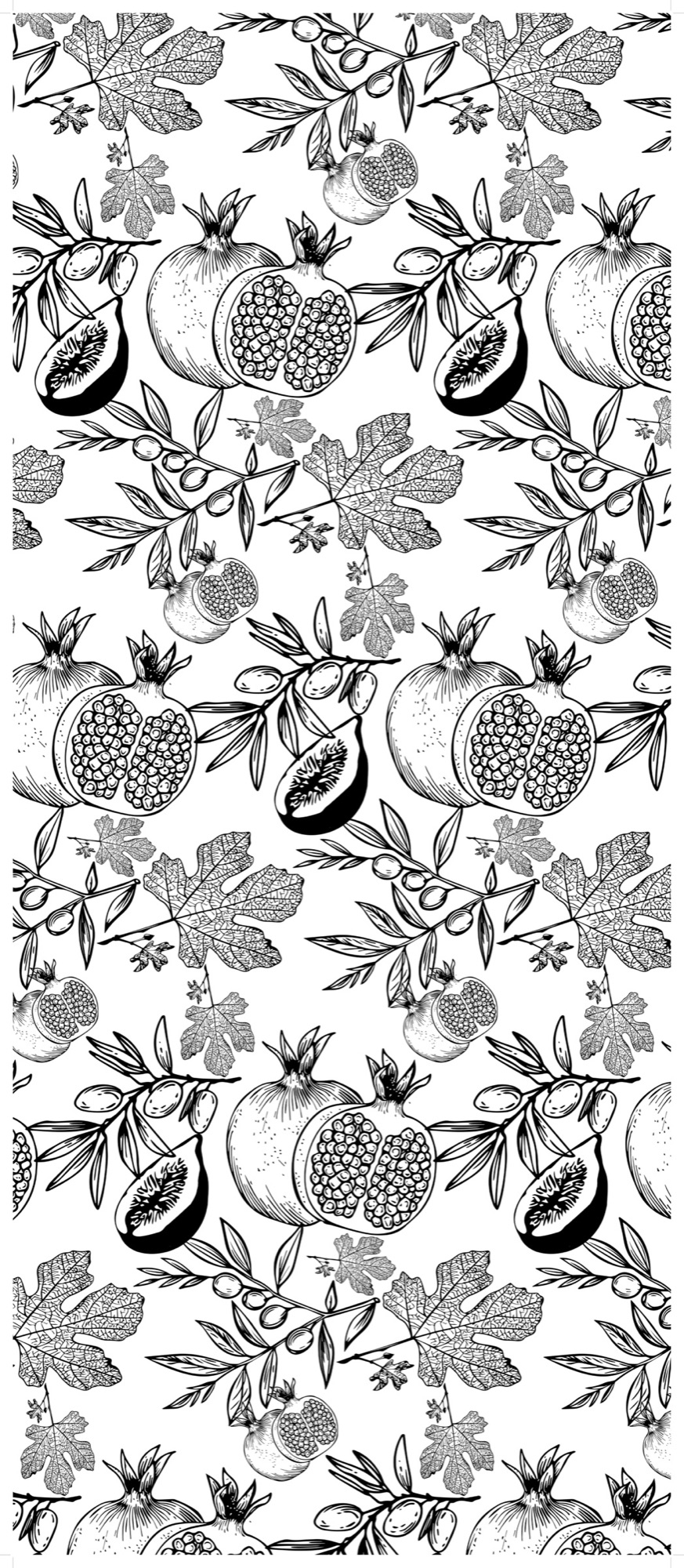
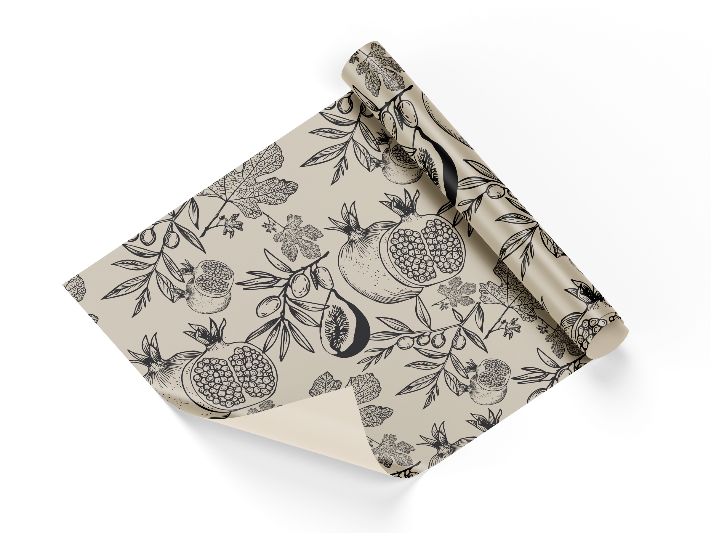
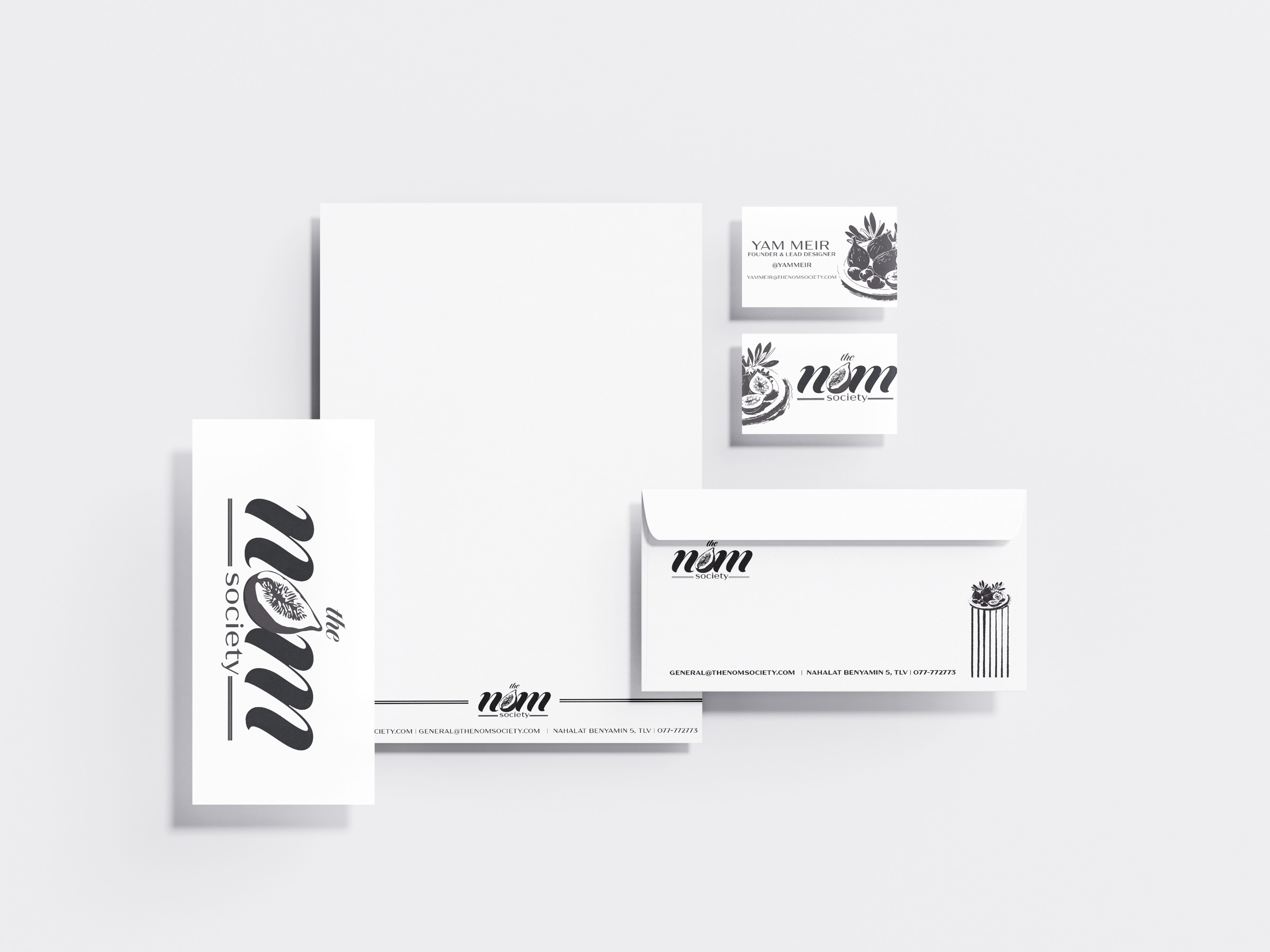
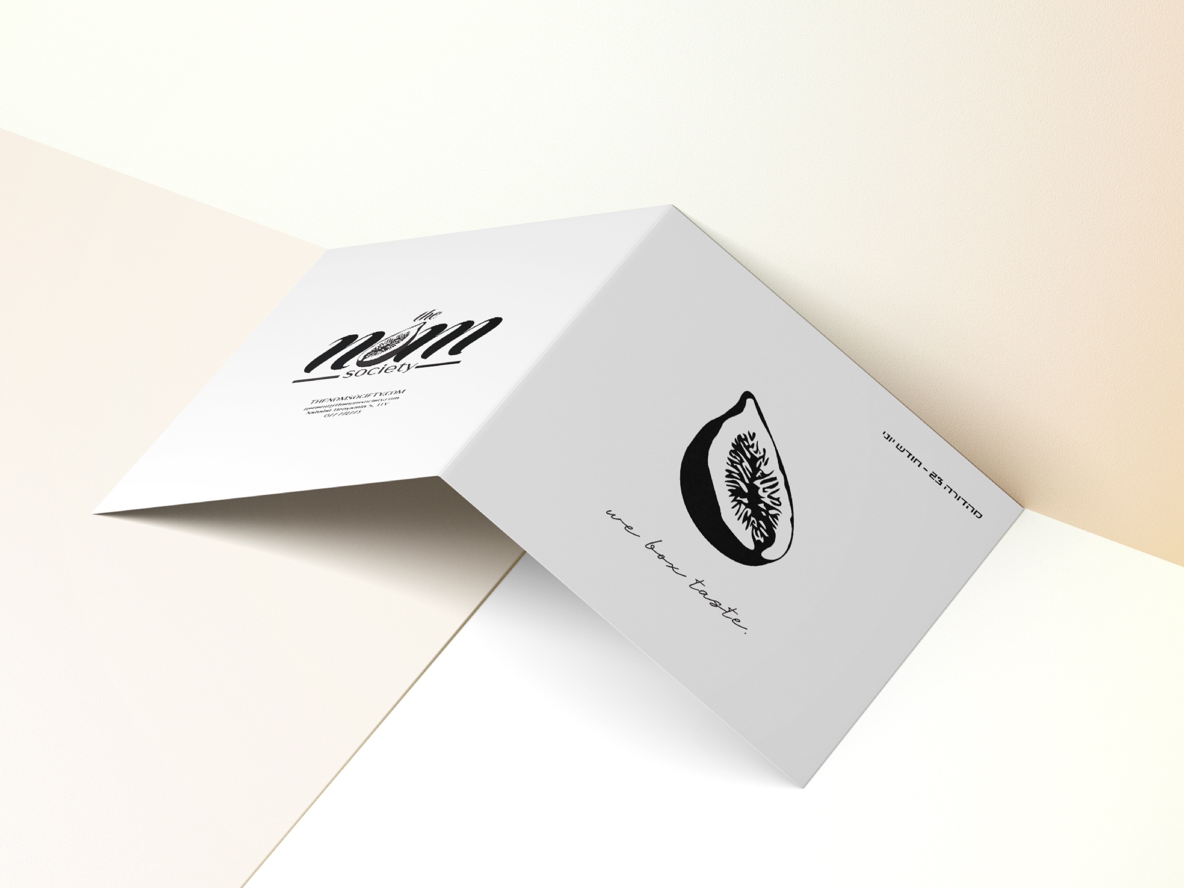
The Nom Society is a product-branding project from my design studies: a members' food society with a fig at its heart. The fig sits inside the wordmark's o, seeds the illustrated fruit pattern, and carries through a full print suite — stationery, business cards, tote, wrapping paper, and a bifold. One drawing, stretched into a whole world.
One fig, everywhere
The whole identity unpacks from a single drawing: a fig cut open. It hides inside the wordmark, multiplies into the pattern, stamps the envelope, and signs the bifold. When a brand has one true mark, everything else is just choosing where to plant it.